
Seton Hall University Libraries
Website redesign
Discover the Story
It has been several years since the redesign of the Seton Hall University Libraries website. The website, though functional and familiar, needed rethinking its information architecture and improvement of its navigation. Our group was happy to respond to this challenge and we went through the redesign process.
We believe in informed design. Our design story is divided into two parts: Research and Design, but they are very much interlinked.
Duration of the project: 15 weeks, January - May 2019
Research methods: Interviews, Questionnaire, Observations
Tools: Lucid Chart, Optimal Workshop, Invision, Sketch
My role: I ensured that we are keeping the deadlines and coordinated our work. Additionally, we shared equally our tasks: conducting user research, drafting new information architecture, evaluating it, preparing low and high-fidelity prototypes.
Research Origin
In January 2019, the Pratt Institute School of Information was approached with an important project - to redesign the SHU website. At the very first meeting, we interviewed our client about the Library requirements.
The new website had to be:
user friendly
accessible for all
and use responsive design
Methodology
When we started to work on our project, we understood, that we need to make a good research, which would inform our future design decisions. We looked both info the requirements from our stakeholder, into our potential users, competition and finally we worked on structuring the website content.

Our process - Research
In the section below, I will present our process step by step. For me, the research phase of this project was crucial. Paraphrasing one of my friends: "Website design is like building a house - if you have the strong fundaments and if the plan of the house is correct, the visual part of the project is simply a decoration. Noone will want to live in a beatiful house, where the front door are at the back and which was not designed for a client".
In our research, we aimed to establish strong fundaments and create a good plan to make our client satisfied and happy.


User Research
Understanding Users
At the very beginning, we had to think for whom we are designing our website. Eventually, we came up with four types of potential users: undergraduate and graduate students, teachers and alumni. However, we didn't know much about them and their needs. Therefore, we started our research.
Together, we have interviewed, observed and surveyed our potential users. The triangulation of methods allowed us to have a clear understanding who might be using our website. To visualise our users, we have created four different personas - that's how you can meet Maggie :)
I have created Maggie persona based on the interviews with 2 graduate students and 2 observations accompanied by a short interviews aiming to get to know our user and his/her needs. In an observation, I used task based approach, where I asked users to interact with a library website and tell me their thoughts.

What did we learn?
Graduate students are not familiar with research terminology and catalogue use. The majority of students experienced problems while performing tasks on the library website, which were caused by the confusion related to the used terminology;
Search bar on the library site is the crucial part of the site design. All students started their research by using a search bar. Additionally, in case they were not sure how to find something on the library site, they were referring to the search bar and using this option to retrieve the required information;
Users access the website on the mobile devices and laptops;
Navigation is a key - users expect to find the information in an easy and hassle free way.
Understanding Competition
SHU Libraries had a very clear opinion, which websites are important for them and why. We have looked into: University of Texas Libraries, NC State Libraries, Harvard Library, Pepperdine Library and Cornell University Library, which we considered interesting.
The Rating Matrix
While looking at these websites, it was clear for us, that we need to develop criteria according to which we will evaluate the website.
Based on feedback from stakeholder and based on the internet research, we decided to focus on: Navigation, Accessability, Appearance, Content and Mobile Friendliness.
We have decided to use simple rating: Good, OK and Bad as it is very user friendly. However, we have described in detail each rating aiming to keep it objective and free from our personal preferences.

Result
After the evaluation, we have received a clear table, which could guide us at our future design work.
We have noted down the good and bad examples of different evaluation criteria. That gave us some ideas for future work. But, before we could have start designing, we had to create an information architecture, which leads us directly to next big section of Research part of our design story: Structuring Content.

What did we learn?
There are no perfect websites, each of the analyzed websites had strong and weak points. Sometimes, it was hard for us to agree about rating of a certain item - we had to practice our negotiation skills :);
While performing Competitive Review, it is better not to include the website we plan to change. This was something, we had to discuss in a class. At the very beginning, we thought it is natural that we will review our website and compare it to others. However, it wouldn't bring much benefit - we knew it needs to be changed. Thanks to reviewing other websites, we could see solutions used by others - very often in the design process, we were coming back to them to illustrate our ideas;
It is important to define used rating. While defining the rating, we noticed that used evaluation criteria were often not clear for us, or each of us understood them differently. Very often we were biased - we have different perception of aesthetics or even usability. Clearly defined rating ensured us to stay as objective as possible and additionally allowed us to discuss what is for us important in designing the website.

Structuring Content
Card Sorting
We approached our card sorting activity by analyzing the current SHU Libraries website. We created an MS Excel file with all possible categories and worked on them to make them as understandable for users as possible. We knew that people who will do card sorting activity will not know the context, so sometimes, in the names of the categories, we had to temporary create one.
As a tool, we used Card Sorting in Optimal Workshop, each of our group members asked 2 test participants to categorize cards in a way which makes sense for them. We have received the pre-analyzed results from our tool and we started to create the draft version of our site map.

Tree Testing
As soon, as we had the draft information architecture of the website, we tested it with new users.
We asked them to go through 7 tasks aiming to allow users to explore whole websites. Unfortunately, results were not really impressive - we achieved only 42% success rate.
This prompted us to twick our navigation structure and reconsider the wording of tasks. With new round of tests, the success rate jumped to 70%!

Site map
After serious of iterations, comparison with competitors, we designed a "final" version of our site map.

What did we learn?
Clear and concise task during tree testing. We found some of the questions during the initial round of tree testing to be a little confusing and unclear and because of this it could’ve possibly lead to difficulty completing the task or lead to direct/indirect failures by the user. Therefore, in the follow up round, we not only modified the site navigation structure but also reworded or created new task to fit the new structure. We found that clear and concise tasks are extremely important to avoid failures that may not reflect bad navigation structure but instead highlight bad directions;
It is important to provide context for the users. While performing both card sorting and tree testing, we noticed it was helpful to provide user with additional information regarding the purpose and context of the test. Users were informed prior to starting the test, via email and welcome message, that the cards or navigation was related to information you would find on a library website and navigation menu. By doing this it provided them with more clarity, understanding, and perspective as they worked through sorting activity or completed each tree testing task.
Use simple and relevant terminology. As user worked through the card sort and tree test, we realized they were having a hard understanding the language we were using to label our cards or site navigation structure. Because of that, it was difficult for them to complete the given task, such as merge cards into groups or find information with the site navigation. Therefore, we renamed the labeling of the card from library terminologies to more globally understood terms. This helped the users a great deal as they completed the given tasks in card sorting and tree testing.
Our process - Design
Good research informs design. Thanks to the preparatory work, we knew who are our users, what they expect from our site and what competition does.
Based on it, we sketched our first wireframes and we evaluated them. Based on the received feedback, we improved our design and we tested it one more time.


Creation and Evaluation
Sketching and Wireframing
At the very beginning of the process, we thought about our users and what they would like to achieve on the website.
Based on the previous user research, we have chosen 2 tasks: Task 1 required users to access the Feedback form, Task 2 was related to the Policies page.
For each task, we have created the task flow, which presented the ideal user path.
Based on the task flows, we have created the paper prototypes, which were recreated in Sketch and made interactive in Invision.

Prototype evaluation
Each of us asked 2 persons to participate in the user testing. Each of the users went through 2 tasks: on mobile and desktop wireframe.
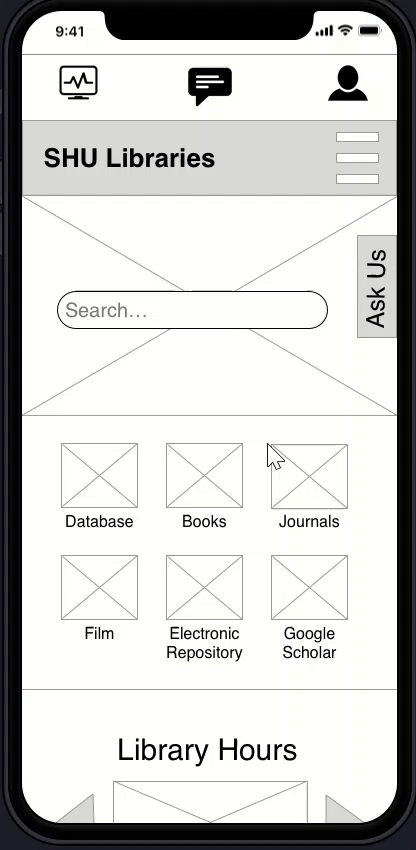
Mobile wireframe
Task 1 was tested on the mobile version of the website. Test participants were asked to imagine, that there are teachers and they had a brilliant idea on how the library could help them in their course. Using mobile interface, they were asked to suggest it to the librarian.
There were two ways in which users could perform this task: by clicking on Ask Us and by using utility menu and Feedback icon. Test participants did not have a problem with accomplishing this task, however they had several comments regarding Ask Us function. They considered it redundant with the content under Feedback icon.
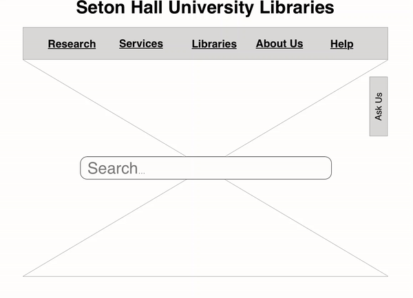
Desktop wireframe
Task 2 was tested on the desktop version of the website. In this case, test participants had to imagine the situation, that they would like to know for how long they can borrow a book. To know this, they had to access the Library Policies.
There was only one way in which users could have accomplished this task: by clicking on About Us and Library Policies. Some users encountered problems while performing this task - they looked for Library Policies in Services. They considered Ask Us button as distractive and missed a search bar.
What did we learn?
Users want to know when something doesn’t work, not when everything works. Both users tested by me were interested in the function of “System Status” button and judged it as not relevant to them. One of the users explicitly said, that she would expect that the systems work and if not, to be notified.
Mobile site: icons have mixed reception. Both users had opposite opinions regarding the user of the icons on the mobile version of the website. One of them suggested to remove them and add to the Top Level Menu, another one described them as very clear.
Mobile and desktop site: “Ask Us” pop-up needs to be redesigned. “Ask Us” pop-up button appeared to be controversial. One of the users pointed out, that it sticks out on the desktop website version and takes away the attention from the Top Level Menu and the Search Bar.
High-Fidelity Prototype
Discussions with our test participants, their critique and peer feedback gave us precious, even though sometimes contradictory, suggestions for improving our prototype. We had to sit down and once again consider the key question - what is important for the users and how we can deliver it.
We have redesigned the information architecture of the website, including simplified and more intuitive navigation. We decided to use two sets of menu: main and utility menu. As per SHU Libraries request, we have used responsive design and created two high-fidelity prototypes for desktop and mobile version of the website.
While designing, we refreshed the look of the website, making it neat and more appealing.
Desktop wireframe
We are proud to share the outcomes of our work. Please click on the image below to see the interactive wireframe of the SHU Libraries website.

Mobile wireframe
We used responsive design in our work - by clicking on the image, you will be able to use interactive options of the prototype.

What next?
After 3 months of work, we have presented our prototypes to SHU Libraries. Unfortuntately, during this time, I had to go for a Fulbright conference and my Gestalt circle couldn't get closed :)
Together with my colleagues, for 15 weeks, we were going through all phases of designing our high-fidelity prototype. When I started this process, I knew very little about design itself. Here, I could see, where are my strenghts and where I should give the leadership to others. The group work was incredibly important and we had to learn to work together, which another process.
In this particular project, I was suprised by the number of steps and the number of iterations. Every design idea we had was discussed and very often challenged. We took ideas from others by performing Competitive Review, but mostly we listened to our users - they were brilliant and provided us with suggestions, which didn't come to our minds. Often, we had to use common sense and sometimes guess and test.
This was our first "real" ux project and for me personally, it was a test, whether "this is it" - I liked so much that design is research driven. This really fits to my profile. I loved the part, that results were visible immediately and we could hear opinions of others. I believe, that SHU libraries will be implement our ideas and they will be real - improving the user experience :).
